FinStories
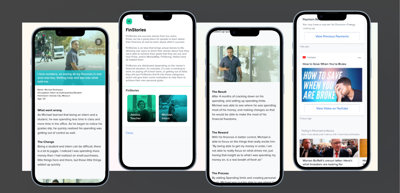
FinStories explored how customers might learn from another person's experience, such as seeing the practical steps someone used to get out of debt.
Pulse helped financial institutions turn behavioral and transaction data into personalized guidance their customers could understand and act on.
This case study follows Pulse from early product definition through release.
Balances and transactions did not always help customers notice important financial changes or understand their spending.
As lead designer, I owned product definition, mobile UX, visual design, prototyping, testing, Engineering handoff, and implementation support.
I designed a prioritized feed of timely, personalized financial insights that could adapt to each institution's brand.
Released to financial institutions. I no longer have post-launch analytics, so I do not claim a quantified customer outcome.

Financial institutions could show customers balances and transactions, but that information did not always help people recognize an important change or understand what their spending behavior meant. MX saw an opportunity to use its data platform to create more useful, personalized digital relationships.
Financial institutions wanted differentiated digital experiences that could improve engagement and financial wellness while integrating into their existing products.
People could miss important financial changes and struggle to interpret their spending from balances and transaction history alone.
Customers should notice relevant changes, understand why they mattered, and take an appropriate next step.
We believed static financial information made it difficult for customers to recognize and act on meaningful changes. If we translated behavioral data into timely, personalized guidance, customers could make more informed decisions and build a more useful relationship with their financial institution.
I was the lead designer for Pulse. I owned product definition, information architecture, user flows, mobile interaction and visual design, prototypes, usability testing, Engineering handoff, and implementation support.
Public MX product material positioned Pulse as an adaptable experience that could use behavioral data and predictive capabilities to deliver personalized insights. The design challenge was making those capabilities understandable at the moment a customer needed them.
Problem. A balance or transaction could show what happened without helping a customer understand why it mattered or what to do next.
Evidence. Customers needed help recognizing important changes and making better sense of their spending.
Decision. I structured Pulse around a feed of personalized Beats: focused cards that surfaced a financial change, translated the underlying data into plain language, and provided a relevant next action.
Why. The card model made complex signals easier to scan while giving the system flexibility to support many kinds of financial guidance.
Expected behavior. Customers should be able to recognize an important event, understand its significance, and decide what to do without interpreting raw transaction data on their own.
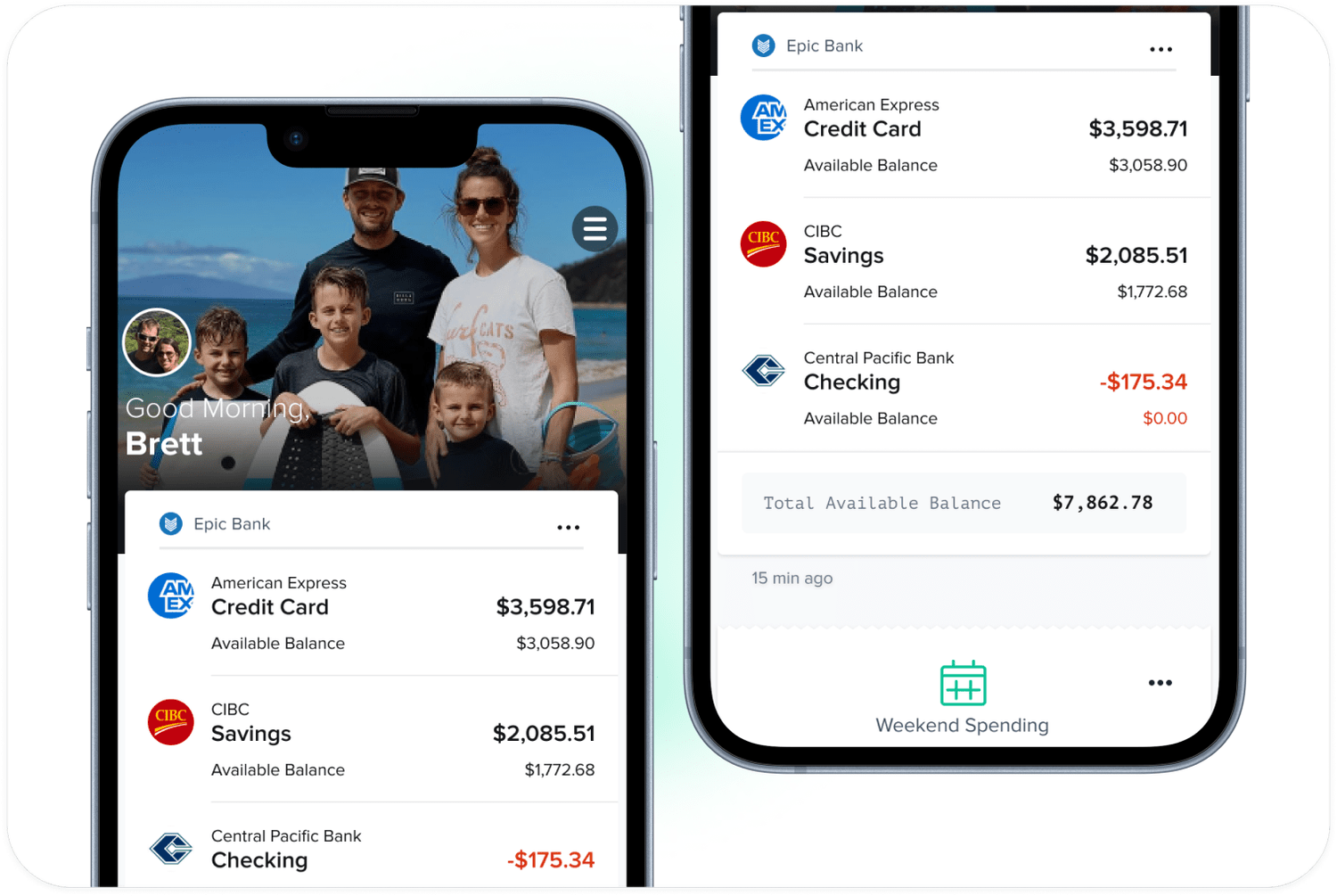
Problem. A feed ordered only by time could allow a newly generated, low-priority card to displace an older event that required immediate attention.
Evidence. Time-sensitive events, such as an overdraft fee, carried greater consequences than many routine updates.
Decision. I designed the card hierarchy to consider both freshness and financial importance rather than treating the newest item as automatically most relevant.
Why. Pulse needed to behave like a useful financial companion, drawing attention to consequential events without making every message feel urgent.
Expected behavior. Customers should see the information most likely to require attention early enough to respond.

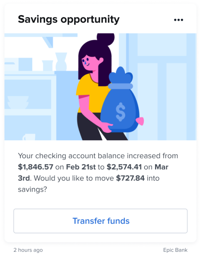
Problem. Pulse needed to feel native inside different banks and credit unions without becoming a separate product-design effort for every implementation.
Constraint. Each institution brought its own visual identity and existing digital-banking environment.
Decision. I created a flexible visual approach in which illustration colors, interface colors, and typography could adapt to an institution's brand while preserving the hierarchy and behavior of the core experience.
Why. A controlled theming system supported institutional trust and faster implementation without fragmenting the product.
Expected behavior. Customers should experience Pulse as a coherent part of their existing bank rather than as a disconnected third-party tool.
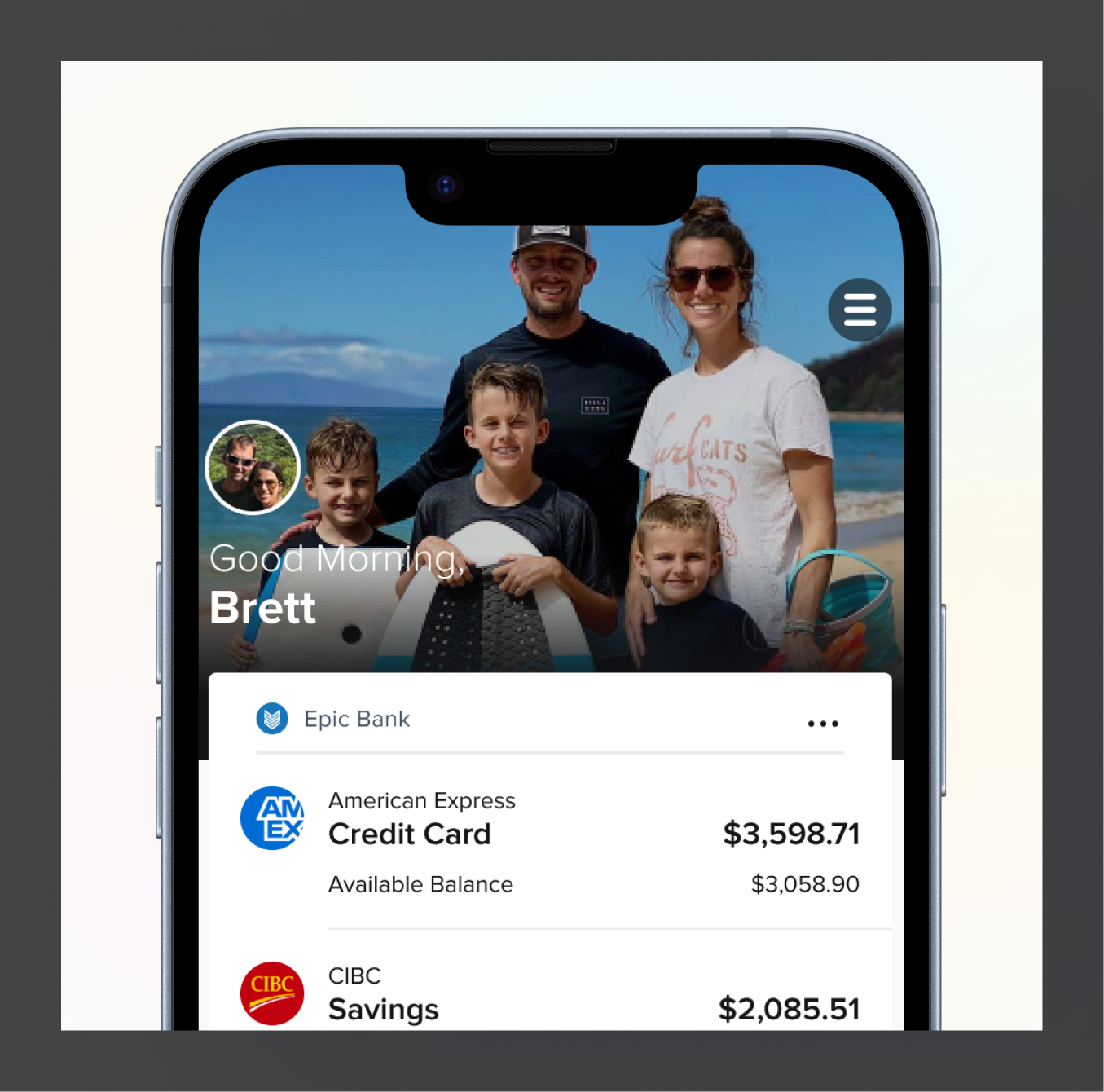
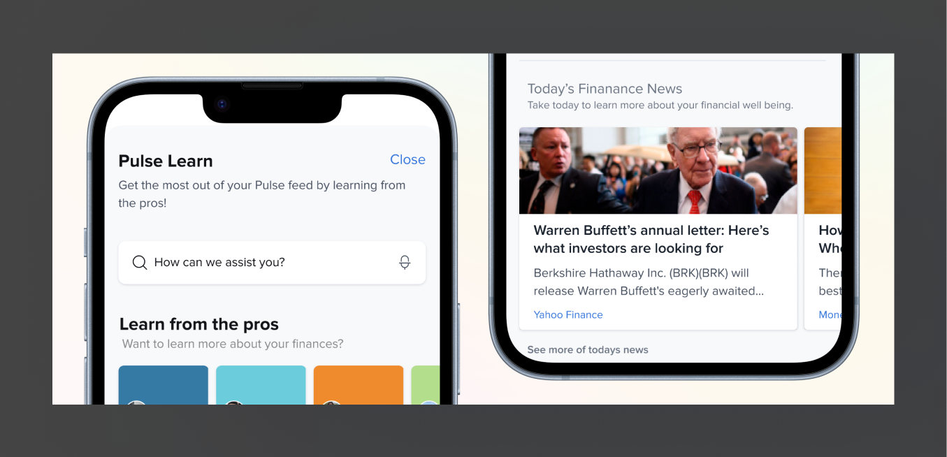
Two concept directions explored how Pulse could extend beyond short financial signals. These ideas were not presented as released outcomes.
FinStories explored how customers might learn from another person's experience, such as seeing the practical steps someone used to get out of debt.
Pulse Learn explored a deeper educational layer where customers could access additional financial guidance from recognized industry leaders.
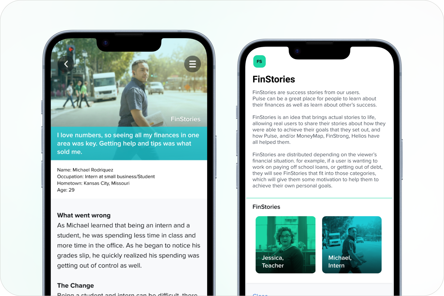
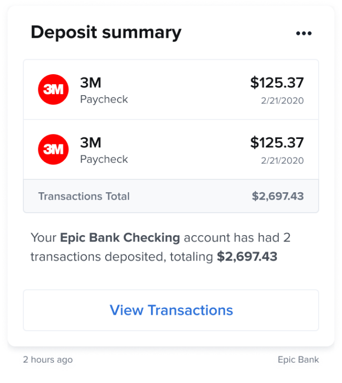
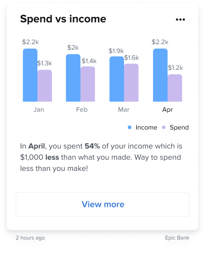
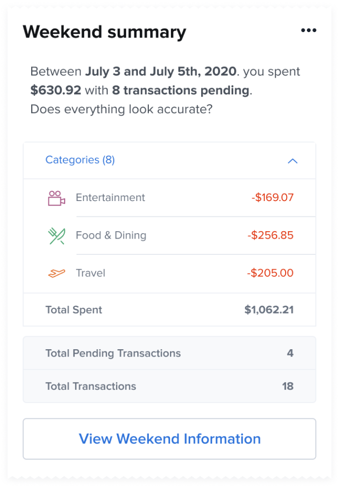
During design, I used prototypes and usability testing to evaluate whether customers could understand individual Beats and identify an appropriate next step. I supported the experience through Engineering handoff and release.
Observed signal. Pulse was released to financial institutions. Publicly, Meridian selected Pulse as part of its digital strategy to provide proactive financial guidance through online and mobile banking.
I no longer have access to post-launch analytics, so I cannot attribute a specific engagement or financial outcome to the design. To evaluate the product directly, I would measure:
Evidence limit: Release and institutional adoption are known. Detailed post-launch product analytics and causal outcome data are not available.
Pulse reinforced that surfacing more data is not the same as creating useful guidance. The experience needed to decide what deserved attention, explain it clearly, and remain calm enough to earn trust.
With access to the product data today, I would test the relationship between urgency ranking, customer action, and notification fatigue more directly while continuing to evaluate how institutional customization affected comprehension and trust.