Internal communication
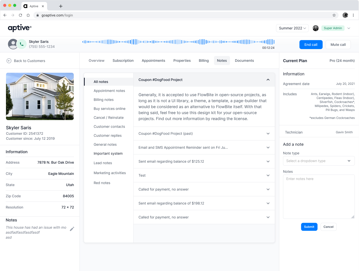
Email and SMS templates, message building, and scheduling helped internal teams communicate with customers more consistently.
My work at Aptive spanned sales planning, onboarding, internal communication, customer accounts, CRM improvements, licensing, and operational tools for field teams.
This page highlights the Sales Planning Tool as one example of that broader work.
Sales managers lacked one clear view of market opportunity, canvassing activity, rep ownership, and territory constraints.
I owned workflow definition, information architecture, interface design, prototypes, testing, Engineering handoff, and implementation review.
I combined opportunity signals, field activity, rep assignments, and adjustable territory boundaries in a desktop map.
Released to production with positive qualitative feedback and an observed sales uptick that cannot be causally attributed to the tool.
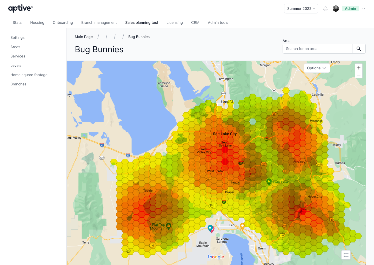
The Sales Planning Tool existed before I joined Aptive, but its primary purpose was limited to tracking sales reps and technicians. As the product expanded, managers needed more support deciding where teams should work, not only seeing where they had been.
Aptive needed to help field leaders use market, territory, and performance data to direct teams toward stronger opportunities and match each area with the right reps.
Sales Operations and managers lacked one clear view of promising areas, prior canvassing, rep ownership, and territory constraints.
Managers should be able to identify an area, understand its context, and assign the appropriate reps with less manual comparison.
If the map revealed opportunity, activity, performance, and ownership at the appropriate level of detail, managers could make faster and more confident territory decisions, improving field coverage and supporting sales performance.
I owned workflow definition, information architecture, wireframes, interface design, prototypes, usability testing, design-system components, Engineering handoff, and implementation review. The work was primarily designed for desktop use.
Most problem evidence came through Product and Sales Operations, with direct rep feedback used when appropriate. I also worked with the Data team to translate regional market signals into usable map layers. Internal requirements documented the need to inspect polygon outcomes, isolate individual reps, adjust territory borders, and understand assignment ownership.
The interface had to move from regional opportunity patterns to team territories and then to individual properties. The Data team helped identify relative affluence across different parts of the country as one signal that an area was more likely to support a purchase. Each map level answered a different planning question without forcing managers into separate tools.
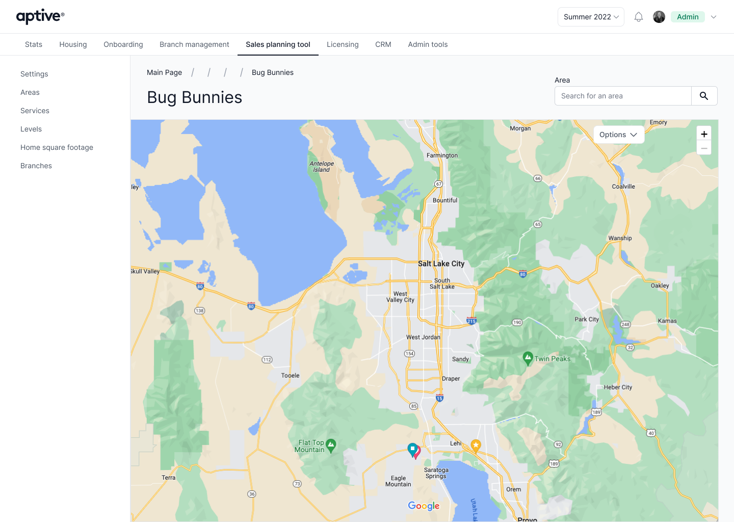
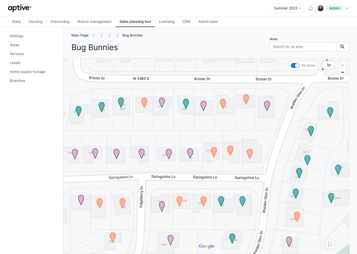
Problem. Property-level data could become overwhelming across a large territory, while a broad regional view did not provide enough detail for daily assignments.
Evidence. Sales Operations needed to identify stronger neighborhoods, understand where teams had already worked, and then inspect specific properties. Regional affluence data provided one signal of where households were more likely to afford the service.
Decision. I designed progressive map layers that moved from opportunity density to property-level detail as managers changed zoom and planning context.
Why. The broader heatmap supported prioritization, while detailed pins supported action. The interface revealed complexity when it became useful instead of showing every data point at once.
Expected behavior. Managers should be able to narrow a large market into a practical canvassing area without leaving the map, then assign a rep whose experience fit the opportunity.
Problem. Team leaders needed to understand which polygons belonged to which reps and isolate an individual's work without manually comparing the map and a separate roster.
Evidence. Product requirements called for rep names in the side list to filter the map, support multiple selections, and provide a quick way to clear the filter.
Decision. I connected the rep list to the geographic view so selecting one or more people displayed only their assigned polygons.
Why. This turned the roster into a planning control and kept ownership visible in the same context where managers evaluated coverage.
Expected behavior. Team leaders should be able to compare assignments, identify gaps or overlap, and focus a planning conversation on the relevant reps.
Problem. Fixed clusters did not give sales leaders enough control to shape territories around the areas they actually needed to assign.
Constraint. Adjustable borders required the product and data teams to support spatial queries rather than relying only on existing cluster IDs.
Decision. I designed a workflow for drawing and adjusting territory boundaries while keeping rep assignments visible.
Why. Flexible boundaries better reflected how teams planned in the field, but the interaction still needed to preserve clear ownership and avoid ambiguous assignments.
Expected behavior. Sales leaders should be able to create practical territories, understand who owns each area, and revise plans as field conditions change.
I tested the experience during design and reviewed the implementation as it moved into development. The Sales Planning Tool updates were released into production.
Release feedback. Feedback after release was positive and indicated that the planning workflows worked as intended.
Observed business signal. Aptive saw an uptick in sales as leaders gained a better understanding of where to send teams and which reps were best suited to each area. This was directionally consistent with the product bet, but I do not have the underlying analysis needed to isolate how much of the increase came from the Sales Planning Tool.
To evaluate the experience more directly, I would measure:
Evidence limit: Post-release feedback was positive but qualitative, and the sales increase is an observed business signal rather than a causal product measurement. I do not have detailed task analytics, a formal research readout, or the attribution analysis needed to present an exact figure as a verified product outcome.
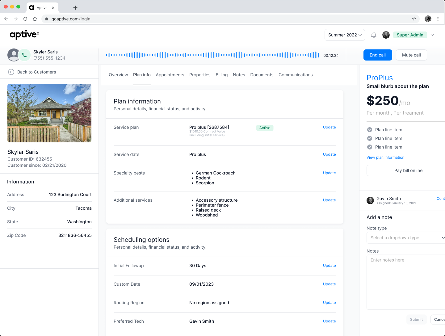
The Sales Planning Tool was one part of a broader body of work. I also designed workflows for customer communication, account management, employee onboarding, pricing configuration, licensing, dashboards, and CRM operations.
Email and SMS templates, message building, and scheduling helped internal teams communicate with customers more consistently.
Account overview, search, filtering, and property views made customer context easier for internal teams to find and act on.
I simplified paperwork-heavy onboarding and designed more adaptable controls for pricing, thresholds, and service configuration.
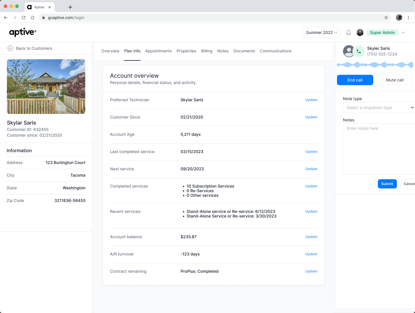
The most important shift was treating geography, performance, and ownership as parts of one planning workflow. Progressive detail helped the same interface support strategic territory selection and practical day-to-day assignments.
With access to the product data today, I would connect usability testing more directly to planning time, assignment corrections, repeat use, and downstream field performance.